Introduction
The Tableau data reshaper is an outstanding tool and you should have it in your toolbox of Tableau techniques if you are serious about doing a lot of data analytics in Tableau. It is well worth the time needed to learn how to use this tool and to understand when to use it for changing the structure of your data sets. It is simple in design and operation but returns huge dividends to you because it allows you to do things in Tableau that you might not be able to do without special programming because of how your initial data is structured.
For years before this tool was available, I had my own version of a data reshaper that I called the “pivot_to_3_column tool”. This tool did exactly the same thing as the reshaper but was not as robust or programmed as cleverly as the Tableau reshaper. I wrote this tool as a vba macro and used it for many projects, so when the Tableau reshaper became available, I was very happy to leave my code behind since I had to customize it for the size of each application.
Why do I feel like writing about the reshaper? Well, if you do big data analytics, statistical analysis (especially regression modeling), or do a lot of work in Tableau, chances are very good that you will need to use this tool to modify the structure of your data to gain the insights you are trying to achieve. Last week I had to perform some statistical analysis on data files that were initially set-up for logistic regression modeling. To do so, I had to reshape the model input files to create csv files that allowed me to do my analysis. These reshaped files were big, ranging from 52 million to over 77 million lines long. The reshaper did this work with no problem and completed the operations at over 1 million records per minute. For reasons like these, the data reshaper is a very useful tool for me.
In this post I give a few examples of why the reshaper is needed and how it is used. There are multiple videos that demonstrate the techniques used and the videos start with a very simple case and they build in complexity. Lastly, what the reshaper does is also called “melting data” and “casting the data” into shapes that you want it or need it to be. For more information on how to do this in another way with the R statistics language, click here.
If you like this article and would like to see more of what I write, please subscribe to my blog by taking 5 seconds to enter your email address below. It is free and it motivates me to continue writing, so thanks!
Installing the Reshaper as an Excel Add-in Package
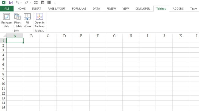
The Tableau data reshaper is really easy to install and use, and since a lot of the data I use arrives in an Excel format, this tool is perfect for me. Click here to download the tool and for instructions on how to install it as an add-in package in Excel. This Tableau technical note is comprehensive so there is no reason for me to repeat any of that content. That note explains what to do if you can’t find the Tableau menu showing up in your Excel ribbon, as shown in Figure 1. Sometimes, the Tableau menu will not appear in your Excel ribbon and you may have to re-enable the tool as explained at the bottom of the technical note. Although this tool gives you three pieces of functionality, I’m focusing this post on reshaping data. You should also try the “fill-down” feature, which is great for quickly filling-in the content of merged cells. It is also a big time saver.
Examples of Using the Reshaper
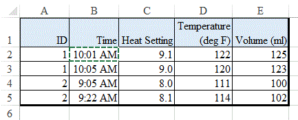
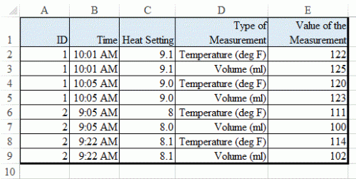
When I first started using the reshaper, I was using it on small files to do simple things like I show in the example below. I was very impressed by the ease of use, since the code automatically handles any size data you throw at it. It understands the number of columns that have to be melted, which is a function of the starting point you give it and the number of columns to the right of your starting point. Figure 2 shows the initial data structure that I want to reshape. This simple example is for illustration purposes only and has only two variables to reshape. In this example, I want the Temperature and Volume to be treated as independent variables, with both of these variables to be treated as a function of the ID, Time, and Heat Setting fields. For that to occur, I chose to start the reshaping in cell D2 and since the data ends in column E, there will be two variables that are reshaped (Temperature and Volume). This effectively doubles the number of records in your data set. Figure 3 shows the reshaped data, which has grown from 4 rows to 8 rows due to the reshaping operation. In actual practice in Tableau, you can do time series analysis with either data set shown in Figure 2 or 3. However, for data sets having a large number of variables, the Figure 3 structure might be advantageous if you want to quickly plot time series analysis of multiple variables on one chart, rather than having to drop individual measures onto your charts. The Figure 2 data structure is preferable if you have a large number of variables on which you want to perform correlations studies (see below).
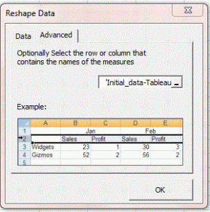
For this example, I have created a short video (Video 1) to demonstrate how the tool works and in the video, I talk a little bit about how you have to choose where to begin your reshaping. The starting point is dependent upon your data structure and how you want the data to be analyzed in Tableau after the reshaping. There is also an advanced option (Figure 4) that lets you select the row that contains the names of the measures in case they are not stored in row 1. In this example, the measure names to be used are not in row 1 but are located in row 2. This example looks like a case where the data you have received has come to you in the form of a pivot table. If your data is in a pivot table form, you should run the other tool shown in Figure 1 that is called “Pivot to Table” before you attempt to reshape the data so that the pivot table controls are stripped from the worksheet. In the example shown in Figure 4, you would want to begin your reshaping in cell B3 and not B2.
Why Would I Want to Reshape the Data Shown in Figure 2?
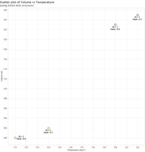
To explain why the reshaping operation may be necessary for you, let’s have a look at the data from Figure 2 and Figure 3 as imported to Tableau. In the original data structure (Figure 2), Temperature and Volume and both measures and I can plot one versus the other without any trouble in the form of a scatter plot as shown in Figure 5. The data structure of Figure 2 is perfect for creating scatter plots and performing correlations. This structure isn’t ideal for doing time series analysis, however, especially if you have a large number of measures. If you have many measures, it is ideal to reshape them into a structure like Figure 3 so that you can do things like use the pages shelf to quickly generate a large number of time series plots. In that case you simply drop the “Type of Measurement Field” in Figure 3 onto the pages shelf and let Tableau sweep through the data sets for you.
Using the Reshaper for a Typical Mid-Size Business Case
As shown in Video 2, a real-world example of business data is used to explain why the reshaper allows you to get to answers that you might not be able to reach otherwise (without some programming in Tableau). This example shows the original data structure, the reshaped data, and a third form of the same data set which is known as the transposed data structure. In this example, R scripts written in Tableau are used to complete linear modeling and to determine correlations statistics for monthly sales data for 217 stores over a 2.5 year period. Video 2 is a little longer and more involved than video 1, but it helps to explain why the data structures you give to Tableau are important and control what you can get done in Tableau. In this example, you are able to create scatter plots of store versus store sales performance. As shown in Video 2, you can choose to plot monthly sales data from 217 stores against any other store.
It is surprising to learn the total number of scatter plots that can be created using this data set. For the sake of argument, lets just say that with 2 variables you can create one scatter plot (assume info learned AxB = BxA). What if your data contained 3 variables (call them A, B, C) instead of 2? In that case you could make three scatter plots of AxB, AxC, and BxC. In the case of 4 variables, you could create 6 plots. In general, the number of scatter plots that you could create from n variables is (n*(n-1))/2. For our 217 store example, we could create (217*216)/2 = 23,436 scatter plots. In a nutritional study documented in the book The China Study, there were about 100,000 correlations calculated, which implies that about 450 variables related to health and nutrition were used in the study. I bet that the China Study authors would have really liked to have had Tableau to do their correlation work!
Adding Some Complexity to the Typical Mid-Size Business Case
In Video 2, we looked at store by store comparisons of total sales. What if your client also gave you other measures such as margin and product returns and asked you to find some insight in that data? Now you have three measures across your stores and across time. How could you do correlation work with Tableau if they mixed these measures into a data structure of two columns to hold the information: one for the name of the measure (sales, margin, returns) and one for the value of the measures? Video 3 explains how you can do this work to investigate trends and patterns across all or subsets of stores by using scatter plots of each of the three measures against each other.
Approaches to Reshaping Big Data Sets
In the previous examples, Tableau and R were used to find answers to common business questions like: (1) are sales at two stores correlated, (2) how are the store sales trending over time, and (3) how are sales and margins in a group of stores comparing to each other? In this next example, the scale of the data is fairly immense and another degree of complexity is added to the problem.
Intense storms, global warming, and rapidly changing weather patterns are all topics in every day news. Although I wrote that sentence yesterday, the CNN headline from today is shown in Figure 5, which is appropriate since I’m talking about data melting!
In a new study released this week, dire predictions are made for continually-increasing atmospheric carbon dioxide levels and maximum temperatures across the world.
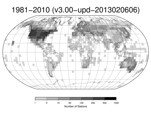
To check some of the published trends and to see if I agree with these types of predictions, I’ve assembled a single file containing a massive world-wide climate database that goes back to the 1760’s. This data file gets blended in Tableau with another database of monitoring station location information. Figure 6 shows the world-wide distribution of the monitoring stations in this database and Figure 7 shows a few records of the raw climate monitoring data.
This climate monitoring data set includes over 150 variables, including precipitation, snowfall, minimum and maximum temperature, among many other specialized readings. This single database has over 2 billion records (8 columns wide = over 16 Billion pieces of data). Although I work with this file just fine in 64-bit Tableau for doing time series analysis (see an upcoming blog post), completing correlations between weather variables is not as straight-forward. However, if you watch video #3 above, you should be able to visualize using the approach shown to generate scatter plots to examine correlations between any of the 150 variables that you might want to investigate. Additionally, since the climate data set is blended with location information, it is possible to do both spatial and temporal analysis with this information. Reshaping big data sets like this are time consuming and may not be practical in some cases. Techniques for reshaping this type of data will be covered in a future post.
In an upcoming blog post I’ll also be documenting the usage of this 2 Billion line climate data file to investigate relationships between weather variables. I will look at changes in precipitation and maximum temperature in West Texas over the past few years, for example. I want to see if I can understand why drought conditions have formed there and in other areas of midwest.



Dear Kenny,
I have been downloading data with n numeric variables from World Development Indicators into Excel. for two variables initially the data is in this form:
Country – Series Name – Year1 – Year2 – Year 3
Country 1 – Death Rate – Value 1 – Value 2 – Value 3
Country 2 – Birth Rate – Value 4 – Value 5 – Value 6
After DataShaping the data is in this form:
Country – Series Name – Year – Value
Country 1 – Death Rate – Year 1 – Value 1
Country 1 – Death Rate -Year 2 – Value 2
… … … …
Country 1 – Birth Rate – Year 1 – Value 3
Country 1 – Birth Rate – Year 2 – Value 4
What I want is this form:
Country – Date – Birth Rate – Death Rate
Country 1 – Year 1 – Value 1 – Value 2
Country 1 – Year 1 – Value 3 – Value 4
And so on.
So far I have only been able to do this by processing one variable at a time and combining the results. This would take a long time if the variables are many – and life is short.
Dear Kenneth,
Please forgive me for commenting on your posts on a basic level. I do not want to throw mud into the clear waters of your blog.
It seems to me that I could also get the structure that I want by datashaping a multivariable table by sorting on the series, copying and pasting the series successively on the right of the first series, deleting series columns and renaming value columns. This is also very cumbersome.
As I understand it, your video three shows how to open a table with Measure Type and Measure Value columns in Tableau and using R to process the data so that you can for example correlate the variables. But how would you go about transforming the table into parallel variable columns before opening the table into Tableau?
Pingback: From World Development Indicators to Tableau - Data and Decision Analysis
Pingback: Benchmarking Data Reshaping in #Alterxy | 3danim8's Blog